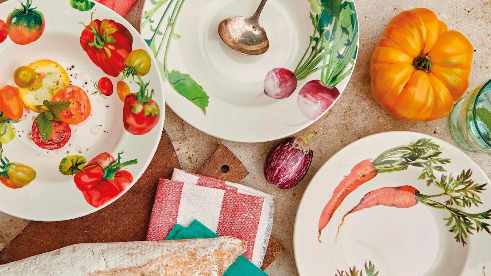
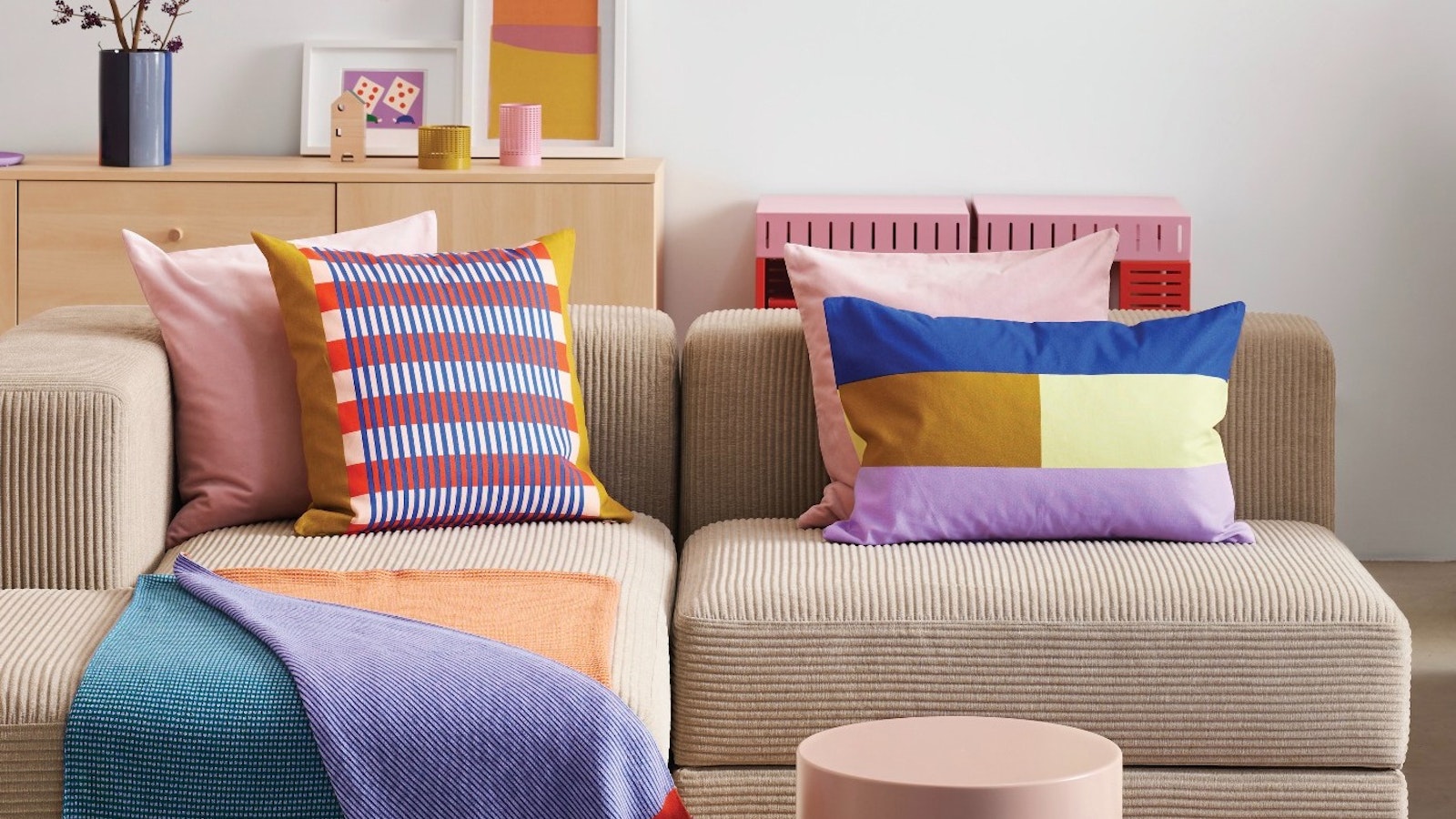
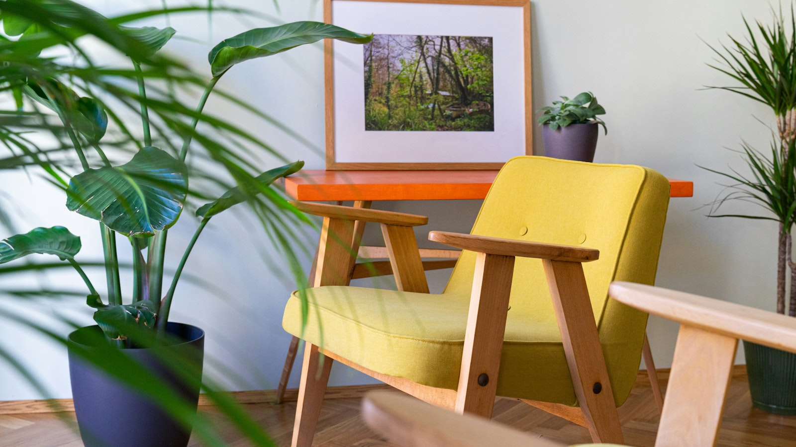
Trends come and go. Anyone who pays the slightest attention to such things will know that there was a time that it seemed as though no colour but sage green seemed to exist at all. After that, several more than fifty shades of grey edged out the greens, followed by a preference for deep jewel tones. Our advice? Forget all of that. You want colours that delight your senses – whether that delight is derived from pops of bright colour, celestial whites or muted and soothing tones. It is all highly subjective and, of course, depends on the natural light in the room.
These are a handful of the tones that make our hearts sing.
Farrow & Ball’s Setting Plaster
We have come to think of certain shades of pink as neutrals – and particularly lovely neutrals at that. Setting Plaster is a masterclass in how soft and soothing tones can affect your mood, as well as being endlessly flattering. If this dusty pink laundry were ours, we’d spend many more happy hours doing the ironing than we currently do.
Little Greene’s Stone
Beige got a bad name for a long, long time and not without reason. Little Greene’s Stone – alongside a profusion in its ilk – puts that to rights, demonstrating how a restrained palette can make a room feel endlessly relaxed, as well as inviting pairings with deeper darker colours to add interest.
Paint & Paper Library’s Muga
If you’re looking for depth and richness, then Paint And Paper Library’s Muga is about as intense as it gets, its ochre yellow bordering on the golden and evoking shades typically found in achingly beautiful Italian architecture.
Edward Bulmer’s Clove
If it is a softer yellow that you are after, then Edward Bulmer’s Clove is hard to beat, its buttery, dreamy tones endlessly calming. We’d happily have this in just about any room in the house.
Farrow & Ball’s Hardwick White
It may be called white, but it is, in fact, technically a grey, originally created ‘to touch up the old limewash at Hardwick Hall’. Farrow & Ball’s Hardwick White is chalky, restrained and subtle – and the perfect solution for anyone who wants something light but not stark.
Farrow & Ball’s Babouche
For a pop of pure delight, Farrow & Ball’s Babouche is both endlessly joyful and evocative, inspired as it is by the colour of the leather slippers worn by men in Morocco. Cheerful and ebullient, we especially like it in small rooms for an arresting and uplifting shot of sunshine.
By Nancy Alsop
May 2024